Getting started with GenomicDistributions
Nathan Sheffield
2025-04-23
Source:vignettes/intro.Rmd
intro.RmdIntroduction to GenomicDistributions
If you have a set of genomic ranges, the GenomicDistributions R package can help you visualize properties of your region set. GenomicDistributions produces these nine types of plot:
- chromosome distribution plot - visualizes how your regions are distributed over chromosomes
- width distribution plot - visualizes the distribution of range widths
- feature distance distribution plot - visualizes how your regions are distributed in distance to the nearest feature of interest, like Transcription Start Sites (TSSs).
- partition distribution plot - visualizes how your regions are distributed across a genomic partitioning, such as frequency of overlapping a gene body, exon, promoter, intronic, or intergenic segment.
- signal in regions plot - visualizes signal of interest summary in a set of genomic ranges. In addition to your input genomic ranges, this plot type requires a data matrix with signal values for conditions of interest. As part of associated GenomicDistributionsData package, we have precompiled open chromatin signal matrices, which contain open chromatin signal values across genome from diverse set of cell types.
- neighboring regions distance - visualizes the distance between chromosomes neighboring regions.
- GC content plot - visualizes a probability density function of GC content percentage over the genomic ranges in the query.
- dinucleotide frequency - visualizes dinucleotide content within your regions.
GenomicDistributions can work with any reference genome, as long as you have some annotation data for it (like chromosome sizes and locations of genes). To make things easier for the common use cases, I’ve included in the package basic metadata for the most commonly used features from the reference genomes I use most (hg19, hg38, and mm10). If you need to produce similar plots with different features, partitions, or reference assemblies, that’s also possible, and not much more difficult; GenomicDistributions is very modular and will work with other bioconductor packages to process that data, but it requires one or two additional steps to curate your reference data (see the Custom reference and features section of this vignette).
In this vignette, we’ll go through examples of each of the plots using my common built-in features and partitions. If you want more control, there’s another advanced vignette that will introduce you how to define your own features, partitions, and chromosome sizes for custom analysis.
Philosophy of modular calc and plot functions
Before we start, I want to explain the design philosophy for functions in this package. Many R plotting packages combine calculations and plotting into one function. This may seem convenient, but if you want to plot the calculation results in a different way or combine them with something else, you can’t because you only have access to the final plot. GenomicDistributions divides these tasks so you can use the intermediate data to design your own custom plot, or use the calculated results directly for other analysis.
In GenomicDistributions, each plot type has two functions: a calculate function and a plot function. The calculate functions take your GRanges object and return a table of summary results. You can use these summary statistics how you like – aggregate them across multiple region sets, insert them into other plots you have, and so forth; or, you can simply plug that result directly into the corresponding plot function, which returns a ggplot2 object. Separating the calculation and plotting functions like this gives you more control over your results.
Installing GenomicDistributions
Install GenomicDistributions like this:
if (!requireNamespace("BiocManager", quietly = TRUE))
install.packages("BiocManager")
BiocManager::install("GenomicDistributions")
Or alternatively you can install from GitHub:
devtools::install_github("databio/GenomicDistributions")Loading genomic range data
Start by loading up the package and getting your query set of regions as a GenomicRanges object. I’ve included an example bed file to demonstrate how these plots look. You can load it up like this:
library("GenomicDistributions")
queryFile = system.file("extdata", "vistaEnhancers.bed.gz", package="GenomicDistributions")
query = rtracklayer::import(queryFile)
GenomicDistributions plot types
Chromosome distribution plots
Chromosome distribution plots help you visualize how your regions are distributed across chromosomes. To produce these, you’ll need to specify the chromosome lengths for your reference assembly. There are a few ways to do this.
For the common reference assemblies that I use (hg19, hg38, mm9, and mm10), I’ve included the metadata in the package. If you’re working with one of these genomes, making a plot of the distribution across chromosomes takes just a couple of lines of code:
# First, calculate the distribution:
x = calcChromBinsRef(query, "hg19")

# Then, plot the result:
plotChromBins(x)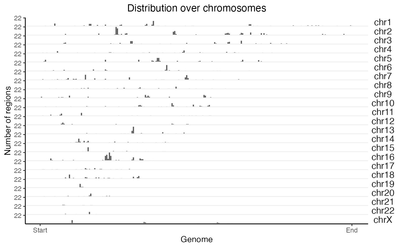
What if we want to do the same thing but on 2 query sets at the same time? No problem:
# Let's fudge a second region set by shifting the first one over
query2 = GenomicRanges::shift(query, 1e6)
queryList = GRangesList(vistaEnhancers=query, shifted=query2)
x2 = calcChromBinsRef(queryList, "hg19")
plotChromBins(x2)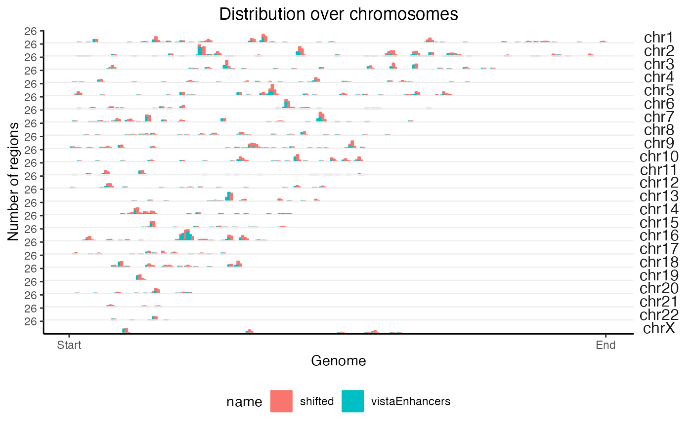
These functions just do a naive binning across the genome. If you want to tweak the way the bins are handled, or use a different reference assembly, that’s also possible and is only slightly more complicated. There are other functions you can use for that, which are outlined in another vignette.
Feature distance distribution plots
Feature distance distribution plots will show you how your regions are distributed with respect to the nearest feature of interest. To illustrate, we’ll use Transcription Start Sites (TSS) as our example feature of interest (but really, you can use any region set).
For TSS plots, since this is such a common use case, we can use a handy built-in function that does everything for us. It’s just one line of code to check distances from query to your TSSs (for common genomes), and then a second line of code to plot those distances:
# Calculate the distances:
TSSdist = calcFeatureDistRefTSS(query, "hg19")

# Then plot the result:
plotFeatureDist(TSSdist, featureName="TSS")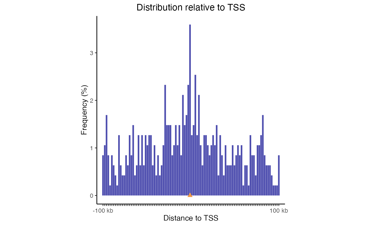
TSS plot. Distribution of query regions relative to TSSs
This plot uses log-scale increasing bins to show how your regions are distributed. Now, let’s make a similar plot with multiple region sets input:
TSSdist2 = calcFeatureDistRefTSS(queryList, "hg19")
plotFeatureDist(TSSdist2, featureName="TSS")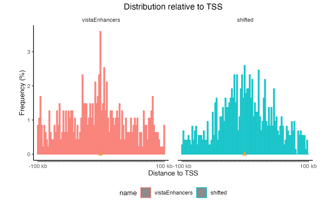
TSS plots with multiple region sets
You can also plot a tiled version that aligns them all vertically, and you can sort the datasets based on the values in the center:
plotFeatureDist(TSSdist2, featureName="TSS", tile=TRUE, labelOrder = "center")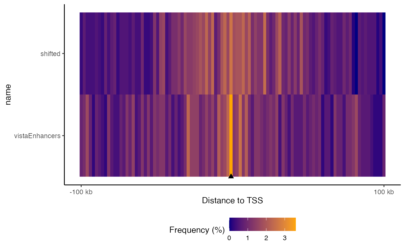
Tiled feature distance plot. Distribution of query regions relative to arbitrary features
If you want to check distances to other features, that’s no problem;
calcFeatureDistRefTSS() is really just a wrapper for the
workhorse function, calcFeatureDist(). To show how this
works, get some features you want to check the distance to. Here, let’s
just shift our query set by a normally distributed random number:
Now, with these features, we just use the
calcFeatureDist function to calculate the distances. This
function uses the fast rolling joins from data.table under
the hood, so it completes very quickly. The result of this gets piped
right into the plotting function as before:
fdd = calcFeatureDist(query, featureExample)
plotFeatureDist(fdd)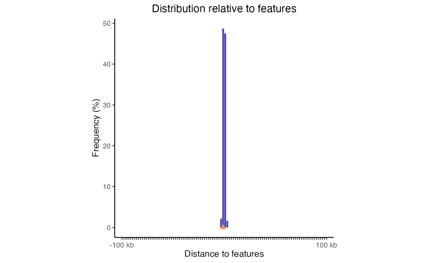
Feature distance plot. Distribution of query regions relative to arbitrary features
Partition distribution plots
Genomic partition distribution plots show you how your regions are distributed across genome annotation classes. This is most commonly used to show the distribution over element types, such as promoters, exons, introns, or intergenic regions. GenomicDistributions provides 3 types of partition distribution plots: percentages, expected, and cumulative.
Percentage partition distribution plots
The most basic partition plot just provides a barplot of percentage region overlaps. You can produce one or two-set plots like so:
gp = calcPartitionsRef(query, "hg19")
plotPartitions(gp)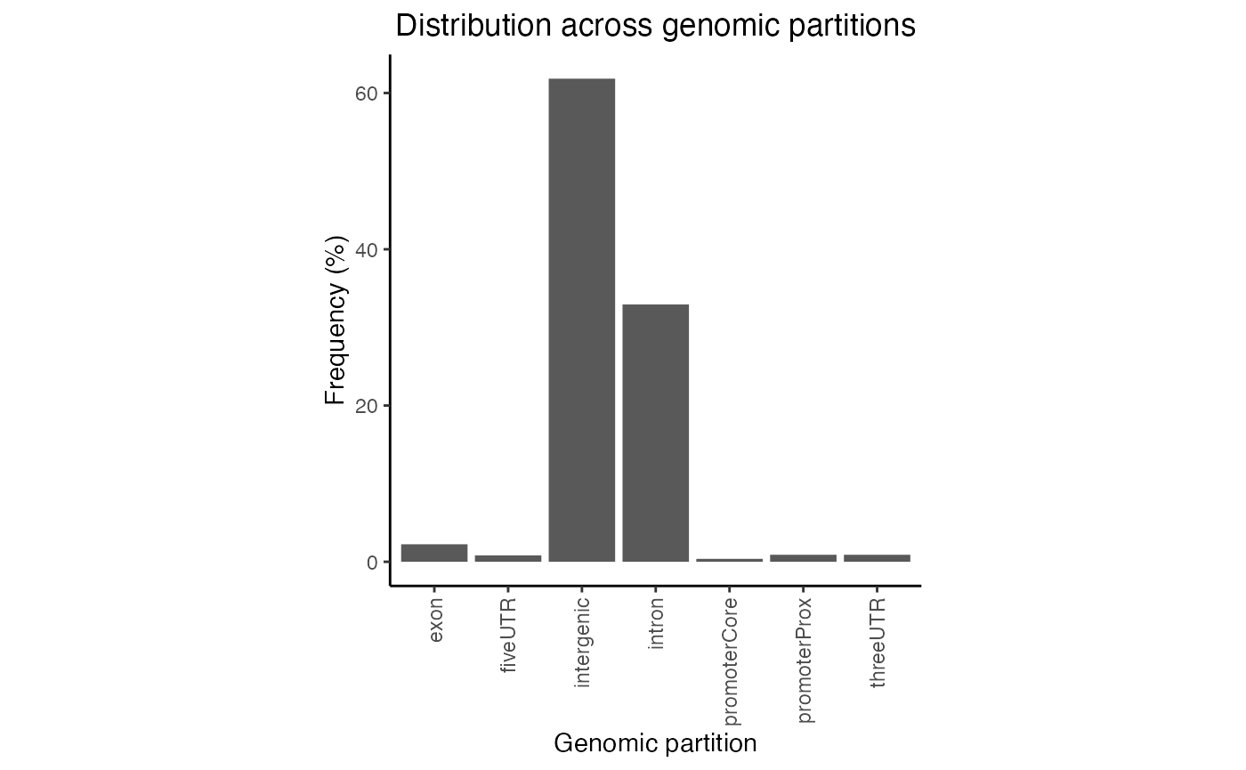
Partition distribution plot. Percentage distribution of query regions across genomic features
gp2 = calcPartitionsRef(queryList, "hg19")
plotPartitions(gp2)
Partition distribution plot for multiple query region sets.
If you wish, you can also plot the raw overlaps across a defined set
of partitions, simply by setting the logical numbers to
TRUE:
# Plot the results:
plotPartitions(gp2, numbers=TRUE)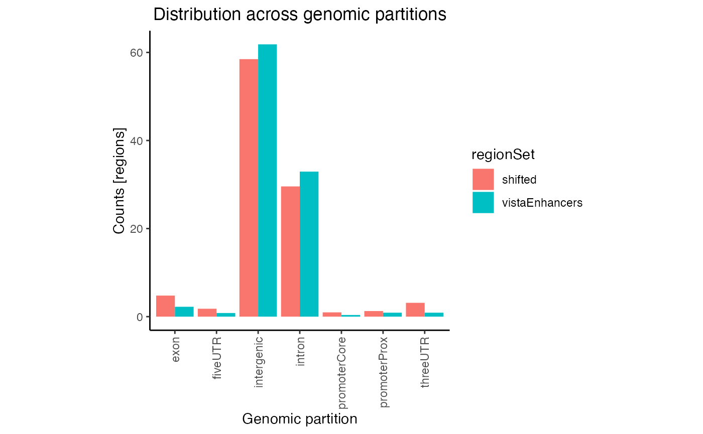
Raw partition distribution plot for multiple regionsets
In this plot regions are classified based on overlaps with annotation classes that are given priority. Once an overlap is found between a query region and an annotation class of high priority, it is not tested for overlaps with annotation classes with lower priorities. In calcPartitionsRef function annotation classes are sorted from highest to lowest priority in following order: core promoter, proximal promoter, 3’untranslated region (3’UTR), 5’UTR, exon, intron and regions not falling into any of these are classified as intergenic. If you are more interested in proportional overlap, i.e. what percentage of bp from your region sets fall into each annotation class, you can just set the bpProportion=TRUE.
gp3 = calcPartitionsRef(queryList, "hg19", bpProportion=TRUE)
plotPartitions(gp3)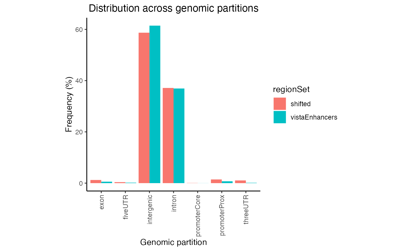
Proportional partition distribution plot for multiple query region sets.
Expected partition distribution plots
A more useful variation of this plot corrects the values for the expected genome distribution. This accounts for the fact that the distribution of intergenic vs promoter space in the genome is not uniform. Here, we produce one or two-set plots showing the log10() of the distribution of your regions across genomic partitions:
ep = calcExpectedPartitionsRef(query, "hg19")
plotExpectedPartitions(ep)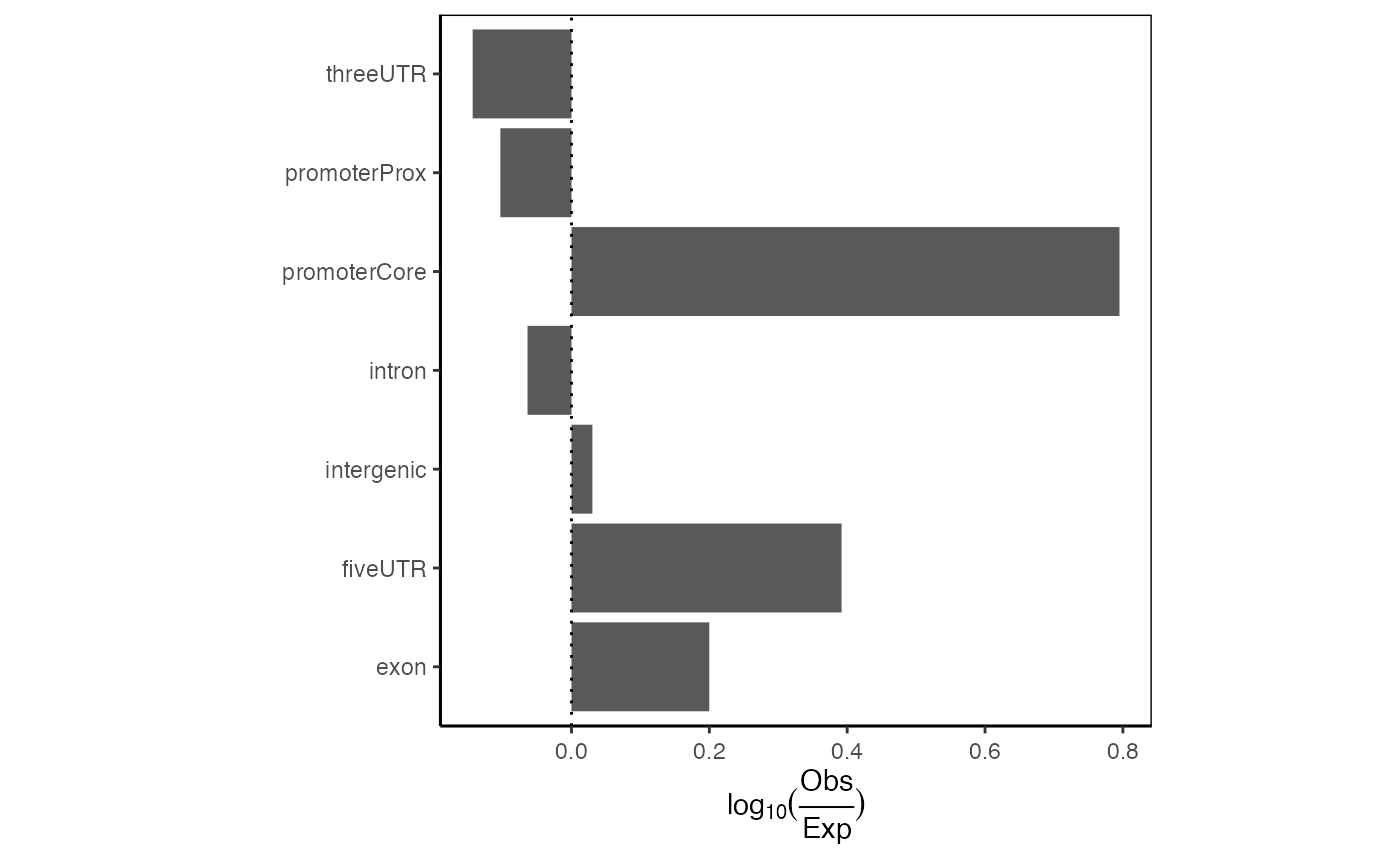
Expected partition distribution plot. Distribution of query regions across genomic features relative to the expected distribution of those features.
And can you do 2 at a time? Indeed:
ep2 = calcExpectedPartitionsRef(queryList, "hg19")
plotExpectedPartitions(ep2)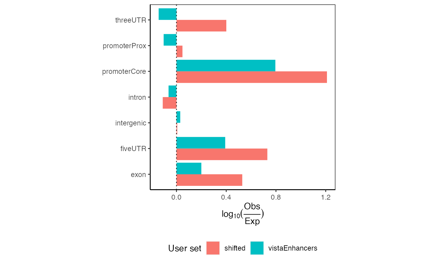
Expected partition distribution plots for multiple query region sets.
Additionally, we have implemented a way to look at the significance
of each partition enrichment using a Chi-square test of independence for
each partition (categorizing regions as observed/expected and
overlapping/non-overlapping). Chi-square p-values are output by the
calcExpectedPartitionsRef function and can be optionally
displayed as stars using the following convention:
***p<0.001; ** 0.001<=p<0.01; * 0.01<=p<0.05; ns p>=0.05
plotExpectedPartitions(ep2, pval=TRUE)
Expected partition distribution plots for multiple query region sets with p-values displayed.
These plots would show all values aligning at 0 if your given regions perfectly match the expected genomic distribution. In this case, we see an 1.5-fold enrichment of introns over the background genome distribution, along with a concomitant decrease in other partitions.
If you are again more interested at proportions how are your regions distributed among the different annotation classes (rather than classification with priority), it is very easy. Let’s see:
ep3 = calcExpectedPartitionsRef(queryList, "hg19", bpProportion=TRUE)
plotExpectedPartitions(ep3)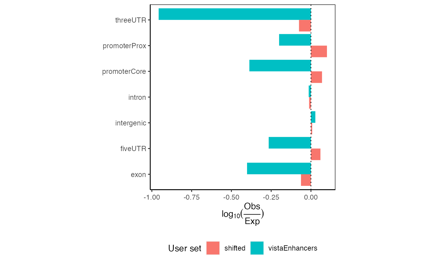
Expected proportional partition distribution plots for multiple query region sets.
Here you can see that even though the differences in observed partition distribution with priority vs. proportional classification are in our example case subtle, the expected partition distribution changed drastically. Given that vistaEnhancers are enhancer regions, thus should be enriched in intergenic space, the proportional classification describes this dataset better.
Cumulative partition distribution plots
The final type of partition plot is the cumulative partition distribution plots. These are a relatively less widespread type of plot that we recently developed. The cumulative partition plot provides an information-dense look into the genomic distribution of regions relative to genomic features. This analysis uses a cumulative distribution to visualize how quickly the final region count is accumulated in features of a given type. To calculate the distribution for this plot, we first sort the query regions by size. We then assign each region to the highest priority partition by computing overlap. For each partition, we compute the cumulative sum of regions in a partition divided by the number of query regions. We weight this calculation by the fraction of the partition covered by the region, so that regions with less overlap contribute proportionally less. We also calculate a complementary cumulative score: the proportion of the partition that is covered by query regions. This gives us two complementary scores: the first measures how enriched the user regions are across partitions, and the second measures how much of the partition is covered by the user regions. The final “enrichment score” is the geometric mean of these two ratios. This enrichment score provides a balanced, interpretable score for how a user set is distributed across genomic partitions. It naturally controls for the imbalance in sizes of partitions. To also show how query regions relate to total genome space covered, we plot the above cumulative enrichment score against the cumulative sum of bases in each feature. Thus, each partition also shows the absolute number of bases covered, which provides a further perspective on the plot.
Now, we’ll plot single and multiple cumulative distributions of regions in genomic partitions:
cp = calcCumulativePartitionsRef(query, "hg19")
plotCumulativePartitions(cp)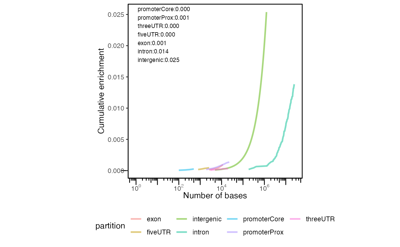
Cumulative partition distribution plot. Cumulative distribution of query regions across genomic features.
Can you plot 2 of these? You can:
cp2 = calcCumulativePartitionsRef(queryList, "hg19")
plotCumulativePartitions(cp2)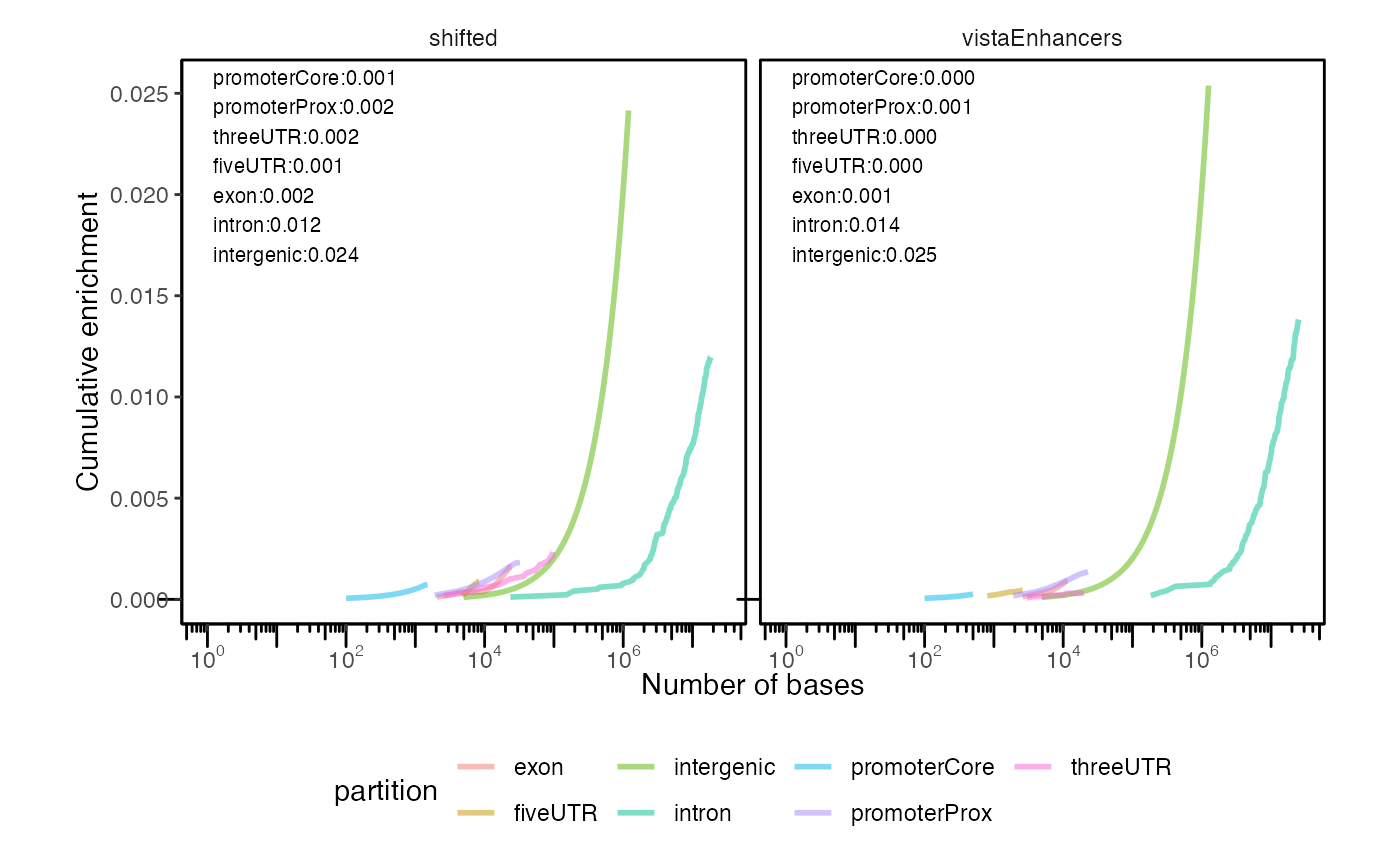
Cumulative partition distribution plots for multiple query region sets.
If you’re not familiar with these plots, interpreting them can take a minute to familiarize yourself. Each curve represents a partition type. The height of the curve indicates the enrichment score, which is a balanced score that averages how much of the query covers a genomic partition, and how much of the genomic partition is covered by the query. The final y-axis value of each curve can be interpreted as how much that partition is enriched in the query regions. The position of the curve on the x-axis indicates the overall bases covered by the partition; therefore, partitions that cover more of genome will arise further to the right. This allows you to simultaneously visualize the enrichment (in the y-axis) as well as the total overall coverage (in the x-axis). Finally, the slope of the curve reflects the size of the regions. If coverage for a particular partition is driven by many small regions, then the slope will be steep; if coverage is driven by few large regions, then slope will be less steep. This is because the enrichment score (y-axis) accumulates with the count of regions, while the bases covered (x-axis) accumulates with the size of regions. Larger regions accumulate size more quickly than count, while smaller regions accumulate count more quickly than size. Therefore, partitions covered by fewer larger overlaps will have less slope than partitions covered by many smaller overlaps.
In this plot, we see that intergenic regions are the most enriched in our example datasets. We additionally see that the intergenic spaces cover a much larger portion of the genome, as indicated by their more right shifted position in the plot.
If you want to see how your regions are distributed among other partitions, like CpG islands, enhancers, or something else, GenomicDistributions also has functions to produce priority lists from any GRanges objects.
Signal in regions plots
The set of functions from this section are designed to summarize and plot signal in query regions across conditions of interest. These functions require an additional input in form of a signal matrix, that contains signal values for conditions of interest. An example of such matrix can be an open chromatin signal from diverse cell types (see below).
One feature we are often interested in is the tissue specificity of a set of genomic ranges. To visualize this, GenomicDistributions provides functions to calculate and plot the tissue specificity. In addition to your input genomic ranges, this plot type requires a tissue specificity data matrix. This matrix should contain a set of genomic regions that have been annotated for tissue specificity signal levels for tissues of interest.
We have produced example reference data matrixes based on ENCODE accessibility information, which can be downloaded from big.databio.org. Here, we’ll demonstrate how this works with some tiny built-in example reference data. For examples of use with the full size matrix see full-power vignette.
In this example we show bar plots with median of signal values across regions being plotted. Otherr offered plotting options are jitter plot showing all signal values across query regions, box plot, and violin plot (with indicated medians).
exampleCellMatrixFile = system.file("extdata", "example_cell_matrix.txt", package="GenomicDistributions")
cellMatrix = data.table::fread(exampleCellMatrixFile)
op = calcSummarySignal(query, cellMatrix)
plotSummarySignal(op)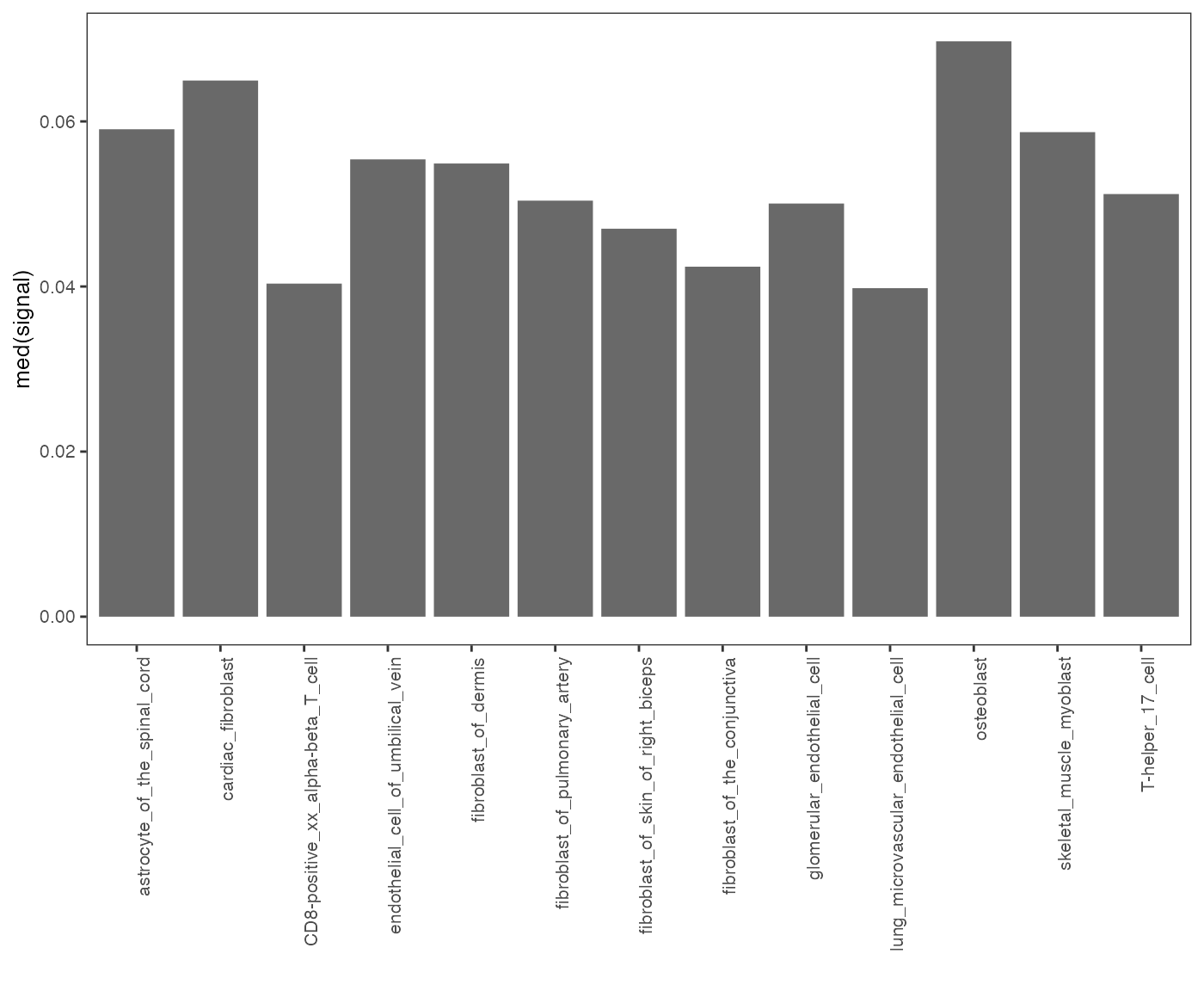
Specificity of chromatin accessibility across cell types.
To plot multiple datasets at a time:
op2 = calcSummarySignal(queryList, cellMatrix)
plotSummarySignal(op2)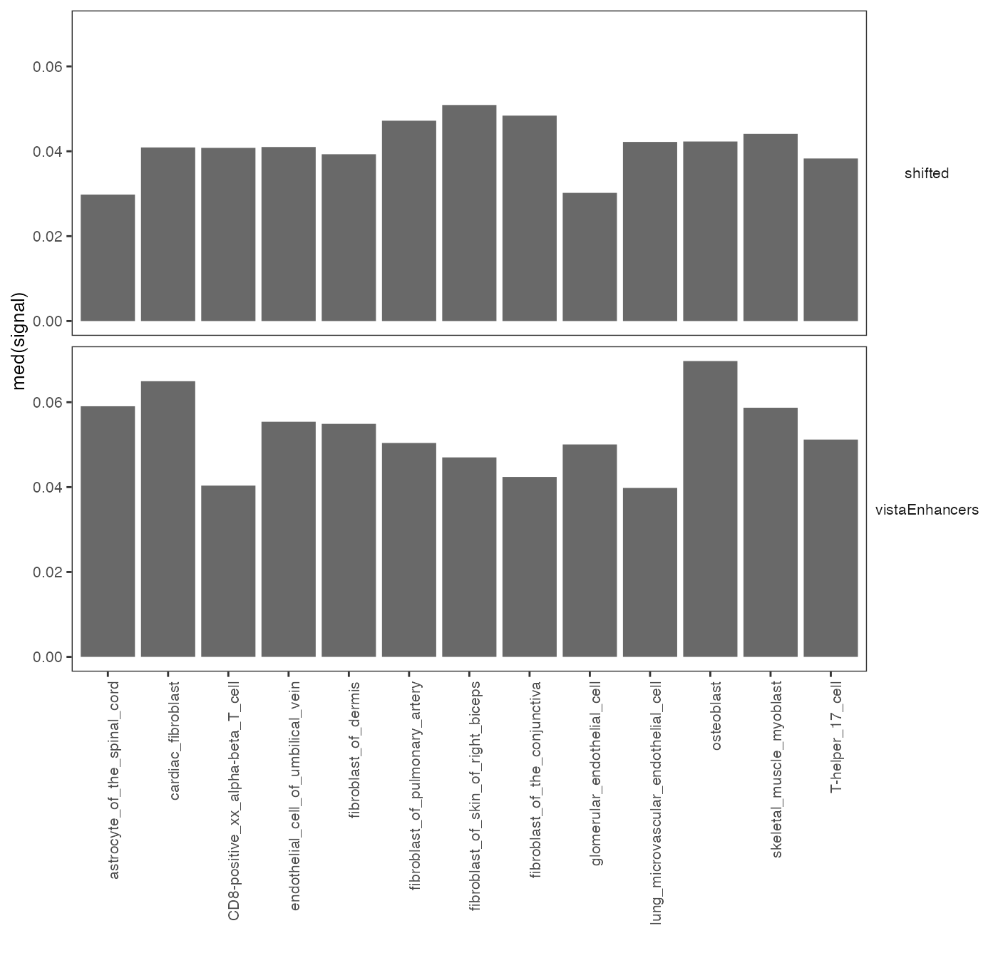
Specificity of chromatin accessibility across cell types.
You can also provide metadata to the plot function in order to add color to different groups. For example, in GenomicDistributions we provide metadata table that assigns cell types to a tissue of origin:
op2 = calcSummarySignal(queryList, cellMatrix)
# get cell type metadata from GenomicDistributions
cellTypeMetadata = cellTypeMetadata
plotSummarySignal(op2, metadata = cellTypeMetadata, colorColumn = "tissueType")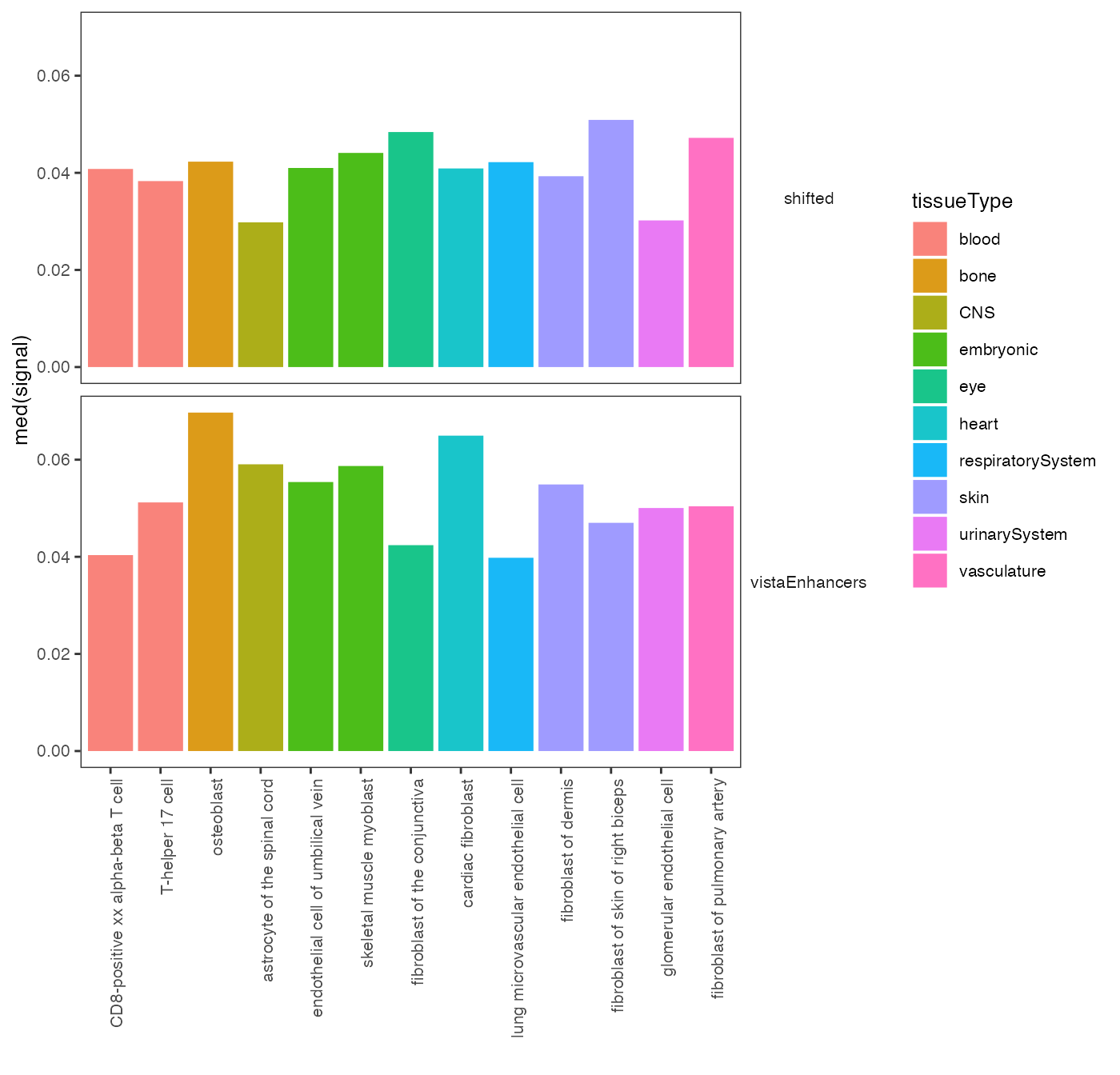
Specificity of chromatin accessibility across cell types.
There are also multiple plotting options. Do you maybe prefer violin plots with highlighted medians? Here it is:
plotSummarySignal(signalSummaryList = op2, plotType = "violinPlot", metadata = cellTypeMetadata, colorColumn = "tissueType")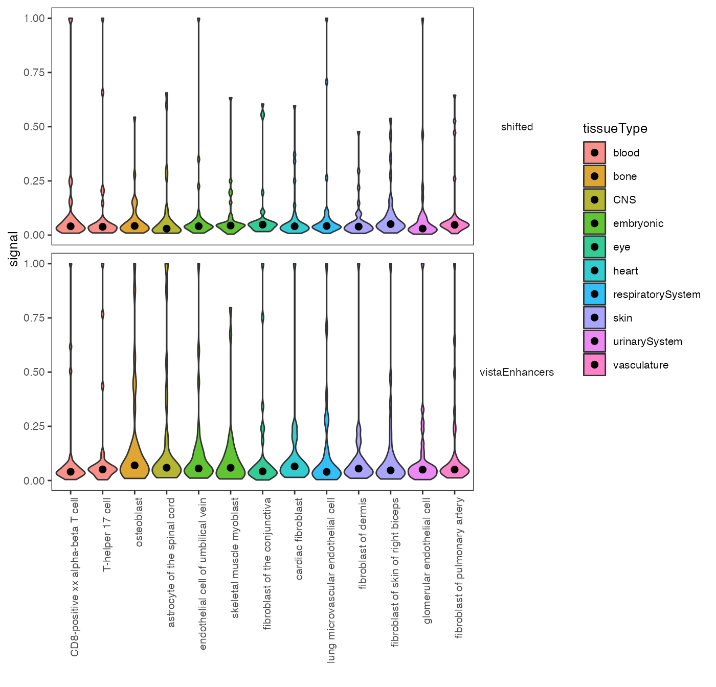
Violin plot: chromatin accessibility across cell types.
Neighboring regions distance plots
Genomic Distributions can also generate some basic stats about your regionset. One of those includes the distance between chromosomes neighboring regions. Distances are calculated for each specific chromosome and then lumped together to get a more comprehensive view of the entire regionset. The scale of the X-axis has been log10 transformed to ease comparison between different regionsets and account for outliers.
# Calculate the distances
nd = calcNeighborDist(query)

# Plot the distribution
plotNeighborDist(nd)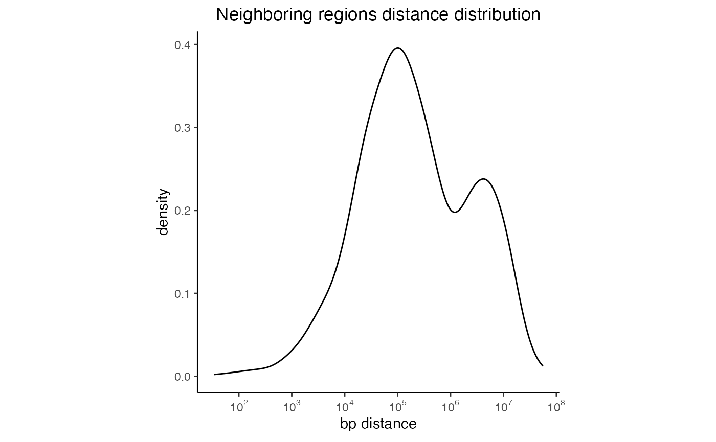
Distances between neighboring intervals of a regionset
You can also look at the distances distribution for more than one regionset:
# Create a list of GRanges objects
s = system.file("extdata", "setB_100.bed.gz", package="GenomicDistributions")
setB = rtracklayer::import(s)
queryList2 = GRangesList(vistaEnhancers=query, setB=setB)

# Calculate the distances
dist2 = calcNeighborDist(queryList2)

# Plot the distribution
plotNeighborDist(dist2)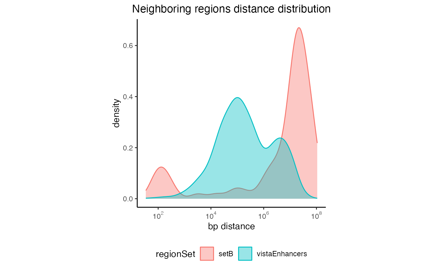
Neighboring regions distance for multiple regionsets
GC content plots
GC content plots display a probability density function of GC content percentage over the genomic ranges in the query. These plots will not be shown in the vignette because they require large BSgenome packages, which contain the full reference sequence.
# Calculate the GC content
gc1 = calcGCContentRef(query, "hg19")

# Plot the GC distribution
plotGCContent(gc1)
You can also plot the probability distribution for more than one query:
gc2 = calcGCContentRef(queryList, "hg19")
plotGCContent(gc2)
Dinucleotide frequency plots
With these set of functions you can calculate and plot what is the dinucleotide content within the regions of interest. The dinucleotide content is calculated for each query region and is then summarized in form of violin plot for the whole region set. These plots will not be shown here either, as they also require large BSgenome packages. Check out “full-power vignette” for examples of these plots.
df1 = calcDinuclFreqRef(query, "hg19")
plotDinuclFreq(df1)
You can also plot the density of each dinucleotide for more than one query:
df2=calcDinuclFreqRef(queryList, "hg19")
plotDinuclFreq(df2)
Are you interested in the actual number of dinucleotides per region rather than dinucleotide frequencies? This can be easily done be setting the parameter rawCounts=TRUE.
df3=calcDinuclFreqRef(queryList, "hg19", rawCounts=TRUE)
plotDinuclFreq(df3)
Width distribution plots
Width distribution plots display a quantile-trimmed histogram (qthist) of widths of the genomic ranges in the query. These plots are quantile-trimmed to preserve the visual shape of the distribution in the face of extreme outliers which sometimes occur in genomic ranges.
# Calculate the widths
qt1 = calcWidth(query)

# Plot the width distribution
plotQTHist(qt1)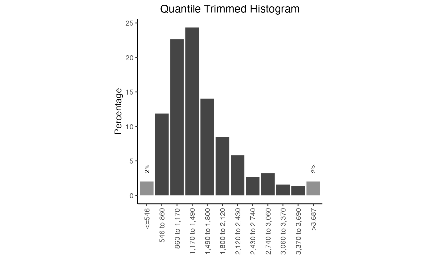
Width distribution plot. Frequency of widths in this query
You can also plot the frequency distribution for more than one query.
qt2 = calcWidth(queryList)
plotQTHist(qt2)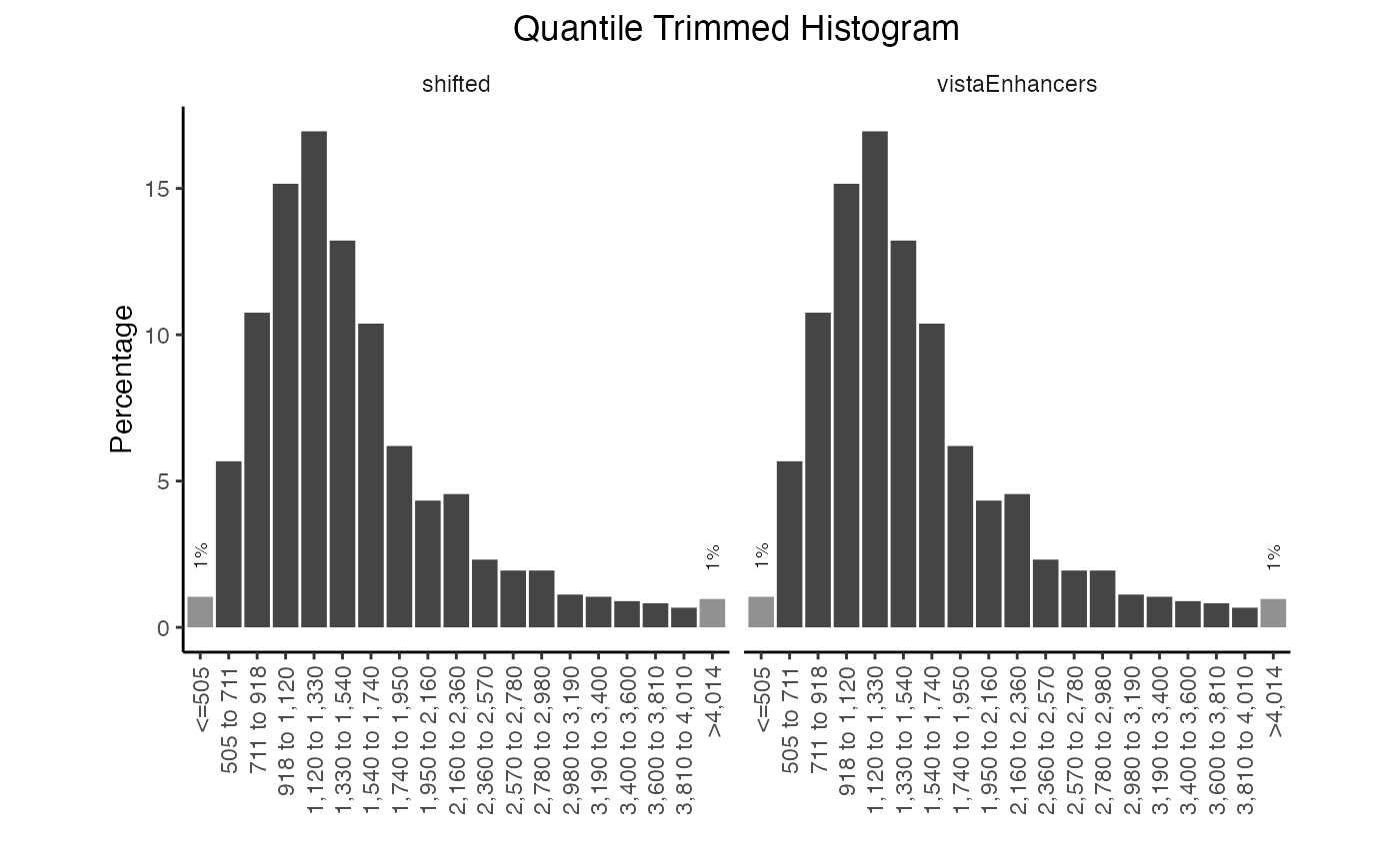
Multiple width distribution plots.
Both the quantile and the bins can be manually adjusted. The quantile you indicate should be the proportion of the data that you want in each end bar of the histogram. You can also adjust the colors of these plots:
plotQTHist(qt1, bins=7, EndBarColor = 'black', MiddleBarColor='darkblue')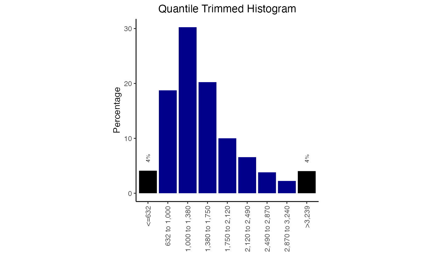
Width distribution plot with color options.
Custom reference and features
Custom reference
GenomicDistributions package comes with a limited
reference data set. There are only files that support hg19
human reference genome (use GenomicDistributionsData for
hg19, hg38 and mm10 genome
reference data - see full-power vignette). If you need any
reference data outside of this selection, these can be easily generated
with functions included in this package.
Here we’ll go over the steps to generate reference data for a C. Elegans genome assembly (Caenorhabditis_elegans.WBcel235.103).
All we need to generate the custom reference data set are two local or remote files. We will use remote files from Ensembl FTP server:
- GTF - http://ftp.ensembl.org/pub/release-103/gtf/caenorhabditis_elegans/Caenorhabditis_elegans.WBcel235.103.gtf.gz
- FASTA - http://ftp.ensembl.org/pub/release-103/fasta/caenorhabditis_elegans/dna/Caenorhabditis_elegans.WBcel235.dna.toplevel.fa.gz
fastaSource = "http://ftp.ensembl.org/pub/release-103/fasta/caenorhabditis_elegans/dna/Caenorhabditis_elegans.WBcel235.dna.toplevel.fa.gz"
gtfSource = "http://ftp.ensembl.org/pub/release-103/gtf/caenorhabditis_elegans/Caenorhabditis_elegans.WBcel235.103.gtf.gz"
Get chromosome sizes
Let’s first have a look, how to extract chromosome sizes:
CEelegansChromSizes = getChromSizesFromFasta(source=fastaSource)You can now these to a getGenomeBins function that will
create equaly sized bins that can passed to calcChromBins
function as bins argument:
bins = getGenomeBins(CEelegansChromSizes)Transcription start sites (TSS)
Now, let’s see, how to extract transcription start sites:
CEelegansTSSs = getTssFromGTF(source=gtfSource, convertEnsemblUCSC=TRUE)You can now pass the CEelegansTSSs to
calcFeatureDist function as a feature argument
to get the distances of your query regions to the nerest TSS.
Gene models
What about gene models for partition plots?
features = c("gene", "exon", "three_prime_utr", "five_prime_utr")
CEelegansGeneModels = getGeneModelsFromGTF(source=gtfSource, features=features, convertEnsemblUCSC=TRUE)
You can now pass the CEelegansGeneModels object to
genomePartitionList function, which created list of genomic
partitions that are then passed to calcPartitions function
as partitionList argument.
partitionList = genomePartitionList(CEelegansGeneModels$gene,
                                    CEelegansGeneModels$exon,
                                    CEelegansGeneModels$three_prime_utr,
                                    CEelegansGeneModels$five_prime_utr)
Custom features (partitions)
Are you missing certain features (e.g. enhancers) in the list of provided partitions for partition plots? You can include custom partitions in few easy steps! In this example we’ll add enhancers to the list of partitions.
First, we’ll grab all of the Ensembl predicted enhancers for
hg19 from the ensembl regulatory build.
funcgen = biomaRt::useMart("ENSEMBL_MART_FUNCGEN", host="grch37.ensembl.org")
funcgen = biomaRt::useDataset("hsapiens_regulatory_feature", mart=funcgen)

enhancers = biomaRt::getBM(attributes=c('chromosome_name',
                                        'chromosome_start',
                                        'chromosome_end',
                                        'feature_type_name'),
                  filters='regulatory_feature_type_name',
                  values='Enhancer',
                  mart=funcgen)
Then we’ll convert chromosome names to the UCSC naming convention to match included partitions. Next, follow that up by converting this into a GenomicRanges object.
enhancers$chromosome_name = paste("chr", enhancers$chromosome_name, sep="")

gr1 = GenomicRanges::sort(GenomeInfoDb::sortSeqlevels(
    GenomicDistributions::dtToGr(enhancers,
                                 chr="chromosome_name",
                                 start="chromosome_start",
                                 end="chromosome_end")))
Now we can add our enhancers GenomicRanges object to the list of partitions we can obtain from the GenomicDistributions package itself.
geneModels = GenomicDistributions::getGeneModels("hg19")
partitionList = GenomicDistributions::genomePartitionList(geneModels$genesGR,
                                                          geneModels$exonsGR,
                                                          geneModels$threeUTRGR,
                                                          geneModels$fiveUTRGR)
partitionList[["enhancer"]] = gr1
You can now pass the newly generated partitionList that
includes enhancers to calcPartitions function.
Conclusion
GenomicDistributions provides a variety of ways to visualize your data. 3 key features make it very useful: First, it uses a modular, systematic way to name calc and plot functions, and the function names and interfaces are all consistent. Second, it is optimized for speed. You will find these functions to be much faster than other commonly accepted alternatives due to way we’ve written the functions under the hood. And finally, it provides a single, convenient package for many types of plots, so you don’t have to look around in multiple places.